8 April 2013 to 15 January 2013
¶ Every Noise at Once · 8 April 2013 listen/tech
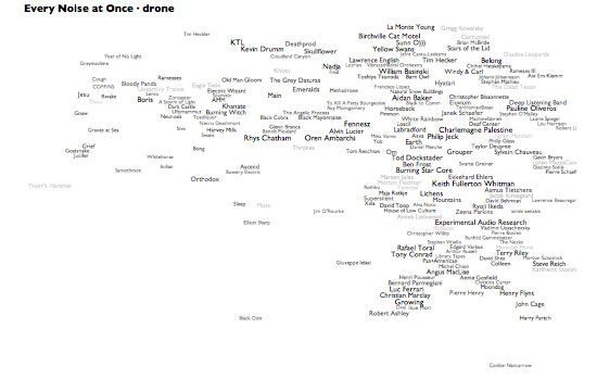
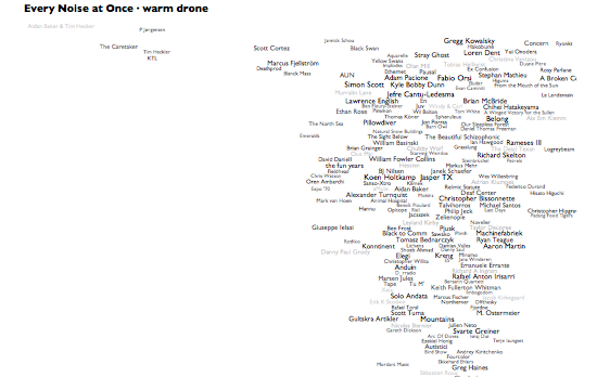
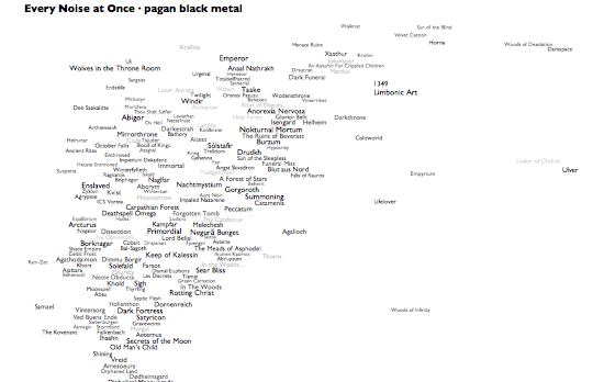
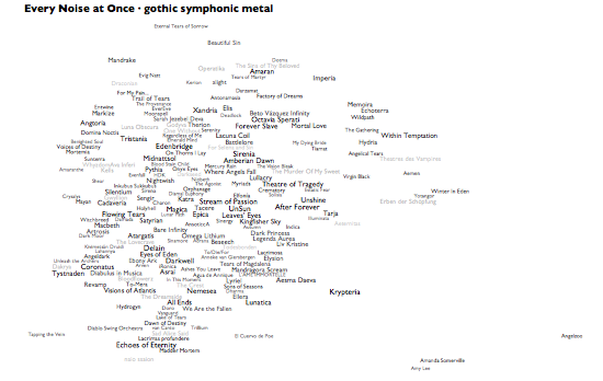
I started making pictures of the music-genre space for diagnostic purposes at work. The exercise keeps threatening to take on a life of its own, but then each new thing turns out to have some functional purpose after all. Which leads to some other analytical feature, which leads to yet another interesting by-product.
This latest not-so-analytical version here adds a whole new level, literally. If you hover over, or click, any genre in the main map, you'll see a » link. Click that to see an artist-level map of that genre, complete with representative audio for each artist and a genre-specific car-radio scanner.
In addition, I've now made auto-generated introductory playlists for each genre on Rdio, and there are links to these at the bottom of the individual genre maps. Rdio's "related artists" come from the same underlying Echo Nest data and processes that drive these genres and their maps, so between these pictures, the Rdio intro playlists, and Rdio related artists from the artists of the songs on those playlists, there's the rough, erratic beginnings of an exploratory path that can lead you from an of-course-inadequate attempt at a overview of all music into at least a representative subset of its component songs. The intro playlists alone add up to about a complete calendar-year of music, which I think says as much as anything about the relationship between humanity and music.
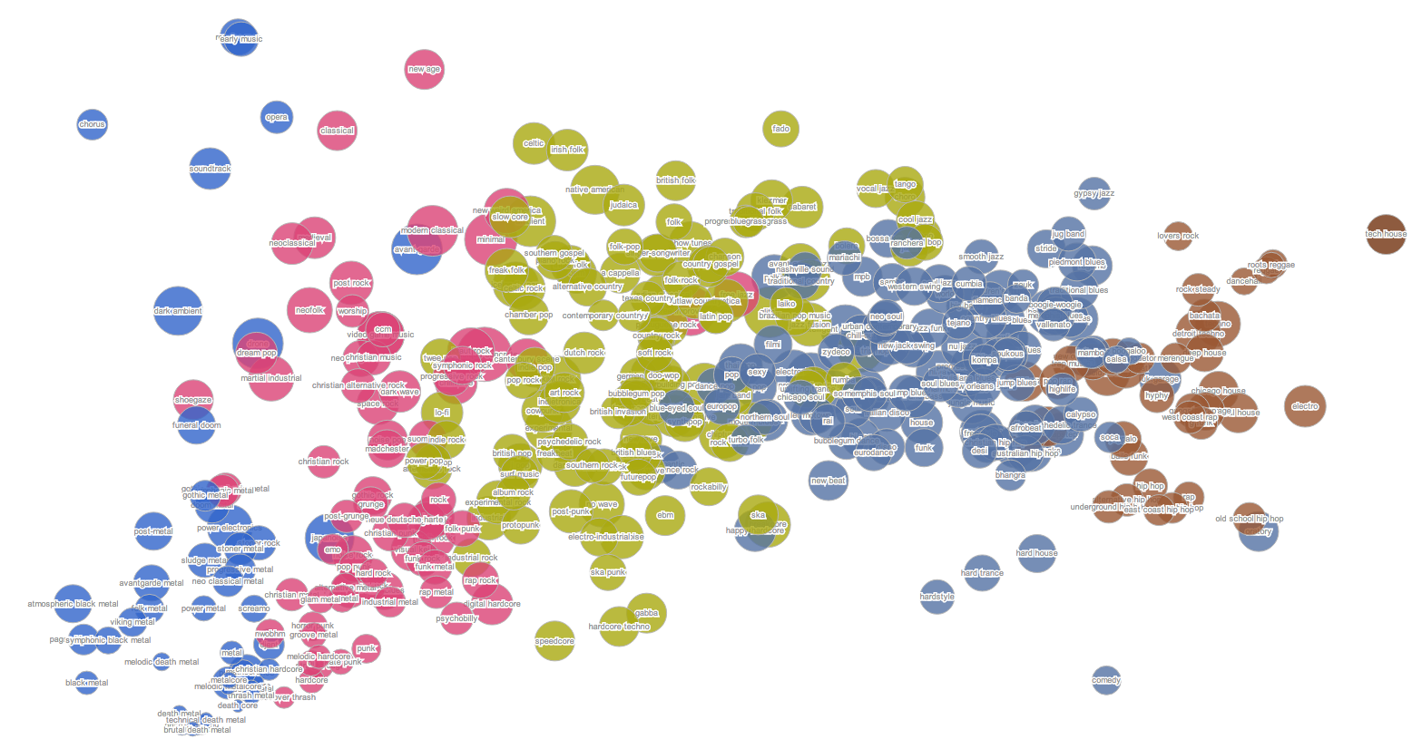
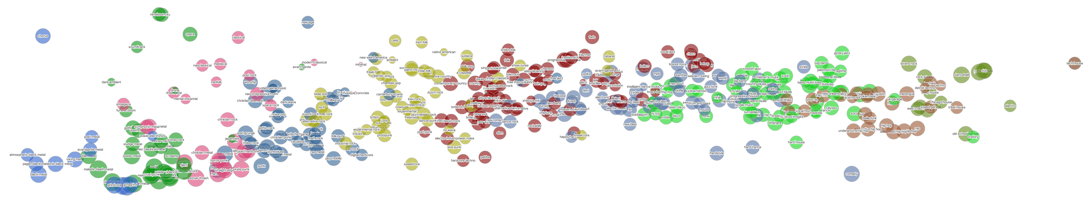
People keep asking me, very reasonably, what the "axes" are on these things. They aren't exactly data plots, due to the cheerfully aggressive algorithmic rearranging of names to make them readable. But roughly speaking, left is more electric and right is more acoustic. And even more roughly speaking, up is more sonic density or uniformity, down is more sonic spareness or spikiness. The less data, the looser the correlations, so the artist distribution within a genre tends to be necessarily less precisely data-related than the distribution of genres. And the genre views are normalized individually, so the bands at the right edge of pagan black metal are actually far less acoustic than those at the right edge of warm drone. If you really want to worry about dimensional distributions and standard deviations, you should come work at the Echo Nest. Otherwise, just focus on the juxtapositions and clusters, and make up your own mind whether they help you think about anything.
Also, lest you think my "Every Noise at Once" title is idle, note that if you alt-click to open different genres in different browser tabs you can turn on lots of scanners at once. I'm not advocating this, exactly, but it is a thing that you can do.
This latest not-so-analytical version here adds a whole new level, literally. If you hover over, or click, any genre in the main map, you'll see a » link. Click that to see an artist-level map of that genre, complete with representative audio for each artist and a genre-specific car-radio scanner.
In addition, I've now made auto-generated introductory playlists for each genre on Rdio, and there are links to these at the bottom of the individual genre maps. Rdio's "related artists" come from the same underlying Echo Nest data and processes that drive these genres and their maps, so between these pictures, the Rdio intro playlists, and Rdio related artists from the artists of the songs on those playlists, there's the rough, erratic beginnings of an exploratory path that can lead you from an of-course-inadequate attempt at a overview of all music into at least a representative subset of its component songs. The intro playlists alone add up to about a complete calendar-year of music, which I think says as much as anything about the relationship between humanity and music.
People keep asking me, very reasonably, what the "axes" are on these things. They aren't exactly data plots, due to the cheerfully aggressive algorithmic rearranging of names to make them readable. But roughly speaking, left is more electric and right is more acoustic. And even more roughly speaking, up is more sonic density or uniformity, down is more sonic spareness or spikiness. The less data, the looser the correlations, so the artist distribution within a genre tends to be necessarily less precisely data-related than the distribution of genres. And the genre views are normalized individually, so the bands at the right edge of pagan black metal are actually far less acoustic than those at the right edge of warm drone. If you really want to worry about dimensional distributions and standard deviations, you should come work at the Echo Nest. Otherwise, just focus on the juxtapositions and clusters, and make up your own mind whether they help you think about anything.
Also, lest you think my "Every Noise at Once" title is idle, note that if you alt-click to open different genres in different browser tabs you can turn on lots of scanners at once. I'm not advocating this, exactly, but it is a thing that you can do.
¶ A Better Picture of Every Noise at Once · 22 March 2013
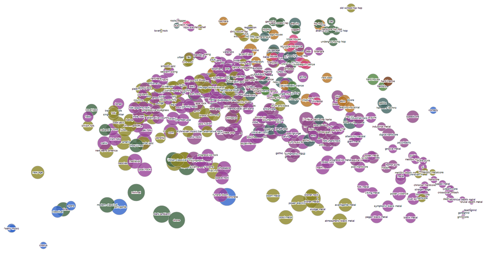
I've been periodically experimenting with other tools for generating bubble-chart pictures of the music-genre space, and after tweaking and cajoling and giving up on several tools it finally occurred to me that maybe the thing I didn't like about my bubble-charts was the bubbles.
And the other obvious wrong thing was that it was just a picture. So here's a new version that is more legible (albeit not necessarily more intelligible), and in which you can hear examples of each genre by clicking on them.
Yes, that's better.
[The audio requires a modern browser like Safari or Chrome...]
[Updated 3/29 with yet another rearrangement.]
[Updated 4/1 with a "scan" feature. Like the whole planet is your car-radio.]
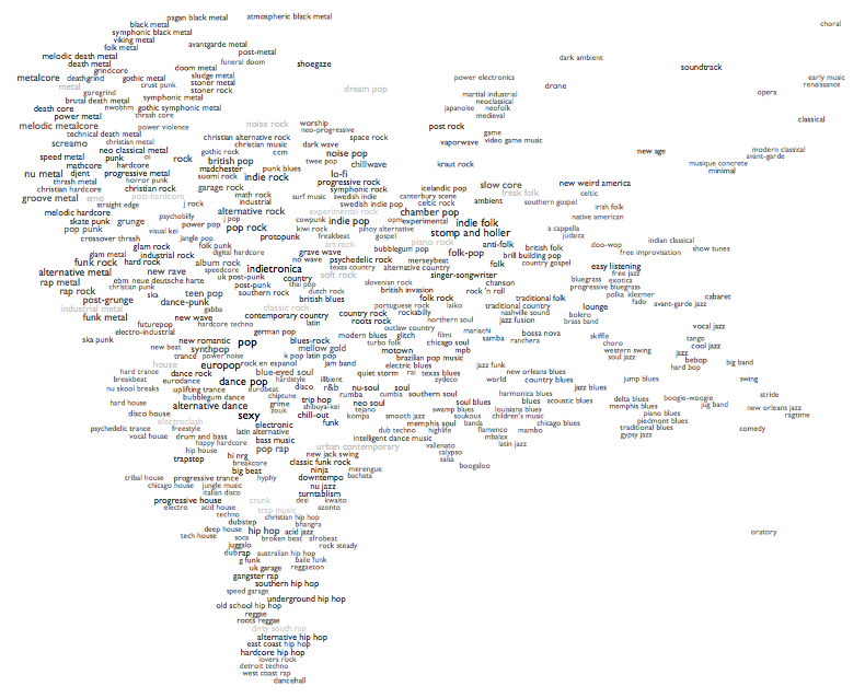
¶ Pictures of Every Noise at Once · 27 February 2013
At work today I found myself making pictures. I should probably get a better tool for making these, so they could be huge and interactive and more intelligible, but there's also something very fitting about this chaotic, overlapping state. Click to see them just barely big enough to read. The third one is actually the biggest and most readable at full size.
[Update: several people have asked me, very reasonably, what the axes and dimensions are in these. Although there are answers, technically, I think that's not really the point here. These pictures are interesting to me precisely without legends and units and grid lines. They are not explanations, they are questions. Are there elements of your experience of music that map to what you see here? Do the things you like, or don't like, cluster or align? Is this a picture of our world, or something else?]
[Update: several people have asked me, very reasonably, what the axes and dimensions are in these. Although there are answers, technically, I think that's not really the point here. These pictures are interesting to me precisely without legends and units and grid lines. They are not explanations, they are questions. Are there elements of your experience of music that map to what you see here? Do the things you like, or don't like, cluster or align? Is this a picture of our world, or something else?]
I needed some Europop this morning. Maybe you do, too. My robots found us some.
Measure my uncertainty about the current function of writing-about-music by noting that although I finalized my 2012 music list by the end of the year, it took me almost two months to get around to even an oblique annotation of it. But here it is:
2012: A Year in a Day
Abridged and unannotated versions are also available:
2012: A Year in a Day
Abridged and unannotated versions are also available:
When a storm approaches, make sure you have sufficient essential supplies: coffee, cereal, soup, the ingredients for making pancake batter from scratch, cats, enough paper to fold a card and an airplane for every person you know, strobe lights, a 5-hour playlist that eventually evolves from frenetic drum & bass into whatever you hope to feel after all of this is done.
At work I have this thing where you can pick any band and pull on the strands that connect them to the rest of the universe of music. This is what happened the other day when I wanted to see where the excellent new Kate Boy song "Northern Lights" took me. Bits of fragile atmospheric sparkly electronica started glittering out and there kind of doesn't seem to be any way to make them stop.
I basically do this kind of thing on and off most work days, and yet nearly every time, even with bands I found this way to begin with, I end up with dozens more interesting songs by bands that I'd never even encountered. I don't think the code is creating the bands out of nothing by its very invocation, but if I hadn't written the code I don't think I'd be so sure.
I basically do this kind of thing on and off most work days, and yet nearly every time, even with bands I found this way to begin with, I end up with dozens more interesting songs by bands that I'd never even encountered. I don't think the code is creating the bands out of nothing by its very invocation, but if I hadn't written the code I don't think I'd be so sure.
In the course of checking something at work yesterday I serendipitously discovered that one of our founders has a deeply personal connection to Christian indie progressive rock, as of course do I. Examples of this sadly unappreciated form can be vexingly hard to find, so I made a little playlist of relevant discoveries to which we can refer if we ever need a spiritual boost. Note that not all of these bands are avowedly Christian, but I think we can agree that this music is doing the Lord's work whatever its ostensible affiliations.
¶ 2012 Pazz & Jop · 15 January 2013
The 2012 Village Voice Pazz & Jop music-critics poll is now out. As has been the case for the last few years, I did the data-correction and tabulation for it. The results of this work are here:
· The Voice's P&J home
· My piece about statistics and analyses
· My massive stastistical hyperindex to the last 5 years of the poll
· My own ballot
The short version: Frank Ocean, Carly Rae Jepsen. If the former of these surprises you, you probably aren't paying attention to music criticism. If the latter, you probably aren't paying attention to pop. Neither of these are life flaws, mind you. But now you have a chance to catch up.
PS: This poll used to be tabulated by people. This is not what people are good at. Eventually computers were employed to help count, but cleaning up the data so it could be counted by computers still took several person-weeks of unpleasant human effort. Then some coworkers and I spent in the neighborhood of 25 person-years building a data-correction and -analysis system with which the whole thing could be done in about 3 person-days. Then Google bought the company for which we made that thing, and shut it down. So I spent about 4 person-days writing a new correction/analysis system from scratch myself, with which this year's poll took about 4 hours to correct and tabulate. Including fixing a few stray errors that the previous system missed.
There is a moral in there somewhere.