
25 November 2013 to 19 August 2013
¶ Good Boring Results · 25 November 2013 listen/tech
Paul Lamere wrote a post on Music Machinery yesterday about deep artists, where by "deep" we mean the opposite of one-hit wonders, artists with large, rich catalogs awaiting your listening and exploration. Paul and I both work at The Echo Nest, trying in one way or another to make sense out of the vast amount of music data the company collects.
Often there is more than one sense to be made of the same data. Sometimes many more than one. I liked Paul's intro about one-hit hits as "non-nutritious" music, with "deep" artists as the converse nutritious music, but after that statement of concept, it seemed painfully ironic to me that his calculations resulted in the #1 score for depth going to the Vitamin String Quartet, which I think of as the artificially-fortified sugar-coated cereal of music. Their catalog, like that of the Glee Cast at #3, is certainly vast and consistent. But I wanted to measure a different kind of depth.
So I ran some different calculations, and made a different list. For this one I took 10k or so reasonably well-known artists, and for each artist calculated an inversely-weighted average popularity of their 100 most popular songs excluding their top 10. If Paul's list is the opposite of one-hit-ness, then mine is the opposite of ten-hit-ness. I'm trying to find the artists whose catalogs are not necessarily the most vast, but where the vastness has been explored most rewardingly, artists where their 100th (or 110th) hit is still empirically world-class.
The good news is that this worked. The bad news is that the resulting list is more than a little boring. We might not have been able to guess this ordering, exactly, but very few of these artists below stand out as fundamentally surprising. Yes, yawn, the Beatles at #1. Eminem at #2 hints at a novelty that the rest of the list doesn't really continue to deliver. I hadn't heard of Argentine singer Andrés Calamaro at #33, but he has won a Latin Grammy and sold millions of records, so that's my ignorance. Conversely, I love Nightwish and Ludovico Einaudi, but didn't fully realize how many other people do, too. Otherwise, yeah, you probably knew about these people already.
But sometimes data reveals new truths, and sometimes, like this, it confirms existing ones. And revealing new truths is cooler, but only if the new truths actually have truth to them, and the best way to confirm our ability to generate true truths is to sometimes generate predictable true truths predictably. Anybody who presumes to do data-driven music discovery ought to have to show that they know what the opposite of "discovery" is. If purported math for "nutritious" doesn't mostly start with vegetables you already know you're supposed to be eating (like Paul's has Bach, Vivaldi and Chopin at #2, 4 and 5), don't trust it.
So the occasional boring is OK, even good, and in that good boring spirit, here's my good boring version of the deepest artists:
- The Beatles
- Eminem
- Pink Floyd
- Iron Maiden
- Red Hot Chili Peppers
- Radiohead
- David Bowie
- Metallica
- Depeche Mode
- Bob Dylan
- Muse
- Coldplay
- Green Day
- Korn
- Tom Waits
- Rihanna
- Kanye West
- Megadeth
- Daft Punk
- The Smashing Pumpkins
- Nine Inch Nails
- The Cure
- Madonna
- Linkin Park
- AC/DC
- Beyoncé
- The Rolling Stones
- Queen
- Britney Spears
- The National
- Jay-Z
- Bruce Springsteen
- Andrés Calamaro
- Johnny Cash
- John Mayer
- U2
- blink-182
- Placebo
- Christina Aguilera
- The Offspring
- The Black Keys
- Foo Fighters
- Taylor Swift
- Michael Jackson
- Lady Gaga
- Moby
- Marilyn Manson
- Nightwish
- Mariah Carey
- Jack Johnson
- Black Sabbath
- Nirvana
- Motörhead
- Nick Cave & The Bad Seeds
- Avril Lavigne
- Arctic Monkeys
- Bob Marley
- Judas Priest
- Oasis
- Blur
- Queens of the Stone Age
- Beastie Boys
- Death Cab for Cutie
- Céline Dion
- Gorillaz
- Slayer
- R.E.M.
- Jimi Hendrix
- Rise Against
- Parov Stelar
- Dream Theater
- The White Stripes
- The Doors
- Bad Religion
- In Flames
- Maroon 5
- Beck
- The Killers
- Michael Bublé
- Modest Mouse
- Hans Zimmer
- 2Pac
- Massive Attack
- Elliott Smith
- Bon Jovi
- Robbie Williams
- The Ramones
- Ludovico Einaudi
- Aerosmith
- The Who
- Sting
- Scorpions
- Sufjan Stevens
- Lou Reed
- Ayreon
- Rush
- NOFX
- Paul McCartney
- Neil Young
- Nas
¶ Supercollector · 20 November 2013 listen/tech
I kind of overprepared for the recent Boston Music Hackday. I ended up presenting a cheerfully simplistic but surprisingly effective automatic chorus-finder, which might conceivably have some future function at work, but that was actually my 5th hack idea, after I accidentally finished the first 4 before hacking was supposed to officially start.
#1, which I accidentally did weeks in advance, was Is This Band Name Taken?, which is pretty literally the simplest possible Echo Nest API application, as it calls a single API function and doesn't even check the result other than to see if there is one, but still got me and the Echo Nest into the Boston Herald yesterday.
#s 2, 3, 4 and 6 (even #5 turned out to require less work than I pessimistically anticipated) all had various things to do with the Rdio API, and eventually I realized that I was actually writing an alternate Rdio client one disconnected feature at a time, so I put them together. And gave the assemblage a name. And you can try it.
It is called Supercollector. I think this is a pretty good name for a music-management application, and I apologize for squandering it on one that I do not expect to have particularly widespread appeal. Rdio's own software is lovely, and a big part of why Rdio is clearly the best streaming music service anybody has so far made, and my construction of an alternative is intended as a minor addition, not any kind of replacement.
That said, there are a variety of fiddly workflow-ish things I do in the course of exploring music, and Supercollector is designed to do those in a ruthlessly streamlined way. It facilitates using one playlist as a candidate list for another. It turns search results into playlists. It turns artist catalogs into playlists. It lets you poke obsessively through playlists with an obsessive minimum of extra pointer movements. It lets you move whole albums into and out of playlists. It replaces playlist tracks that have annoyingly become unavailable since you picked them. It keeps track of your places in multiple playlists at once.
These are obscure needs, but if they also happen to be among your obscure needs, give it a try.
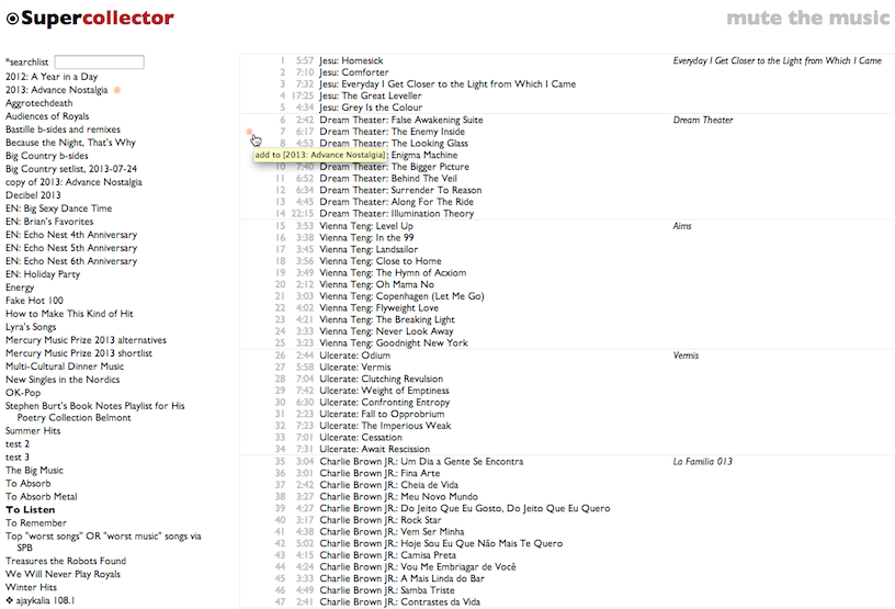
[Obviously you need an Rdio account. I mean, in general. To use Supercollector you probably also need to have some Rdio playlists, otherwise you're going to get a big empty screen with "Supercollector" at the top.]
#1, which I accidentally did weeks in advance, was Is This Band Name Taken?, which is pretty literally the simplest possible Echo Nest API application, as it calls a single API function and doesn't even check the result other than to see if there is one, but still got me and the Echo Nest into the Boston Herald yesterday.
#s 2, 3, 4 and 6 (even #5 turned out to require less work than I pessimistically anticipated) all had various things to do with the Rdio API, and eventually I realized that I was actually writing an alternate Rdio client one disconnected feature at a time, so I put them together. And gave the assemblage a name. And you can try it.
It is called Supercollector. I think this is a pretty good name for a music-management application, and I apologize for squandering it on one that I do not expect to have particularly widespread appeal. Rdio's own software is lovely, and a big part of why Rdio is clearly the best streaming music service anybody has so far made, and my construction of an alternative is intended as a minor addition, not any kind of replacement.
That said, there are a variety of fiddly workflow-ish things I do in the course of exploring music, and Supercollector is designed to do those in a ruthlessly streamlined way. It facilitates using one playlist as a candidate list for another. It turns search results into playlists. It turns artist catalogs into playlists. It lets you poke obsessively through playlists with an obsessive minimum of extra pointer movements. It lets you move whole albums into and out of playlists. It replaces playlist tracks that have annoyingly become unavailable since you picked them. It keeps track of your places in multiple playlists at once.
These are obscure needs, but if they also happen to be among your obscure needs, give it a try.
[Obviously you need an Rdio account. I mean, in general. To use Supercollector you probably also need to have some Rdio playlists, otherwise you're going to get a big empty screen with "Supercollector" at the top.]
¶ The Opposite of Love Is Love · 16 November 2013 listen/tech
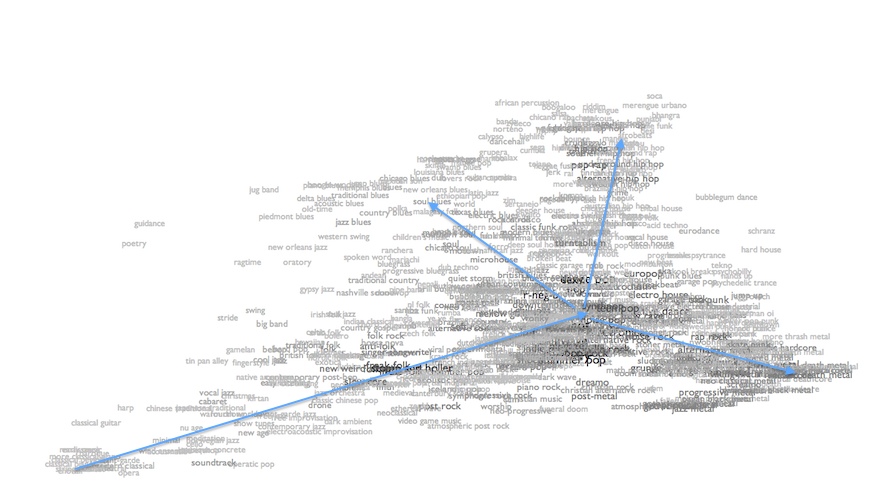
The data and math behind Every Noise at Once allow me to calculate audio similarity between genres, which is pretty obviously cool and useful. The distance scores can be sorted the other way, too, to produce dissimilarity. This works, in the sense that the program doesn't crash before producing results (my first level of quality in computational aesthetics), but it turns out that the farthest genre from pretty much anything is always one of a handful of extreme outliers: choral music, poetry readings, relentless tech house, satanic black metal. This sort of makes sense (my second level of quality), but it isn't very interesting or useful (level three).
It recently occurred to me to try it a different way. Instead of calculating the furthest genre, I instead take each genre's position in the 12-dimensional analytical space, invert it through the origin of the space, and find the genres closest to that inverted point.
Which sounds delightfully abstruse. "12-dimensional analytical space"! But it just means that I'm trying to produce a computable notion of genre opposition that finds some kind of music that is approximately as conventional or extreme as the genre you started with, but in which every individual aspect we can measure has the opposite polarity. So if we have a genre that's a lot faster and slightly louder and somewhat more electric than the average, I look for a genre that's correspondingly a lot slower and slightly quieter and somewhat more acoustic than the average. Except there are 12 metrics, not just 3, which is hard to picture as a space, but no harder to calculate.
This version also doesn't crash, by which I mean that it crashed a little, of course, until I got the right number of "i"s into all the uses of "audiocentricity", and stopped overwriting function declarations with variables (ah, Python...), but now it doesn't, so that's level one.
There's some subjectivity to the question of whether anything under the heading of "opposite of a genre" makes sense. But when I measure that audiocentricity, or how close things are to the theoretical center of the imaginary space, the highest scoring genres include such definitively mild forms as mellow gold, jam band and soft rock, and the lowest scores go to the most recognizably extreme forms (culminating, again, in choral music). And the opposite of choral music turns out to be schranz, and the opposite of symphonic black metal is roots reggae, and the opposite of straight edge is anonymous bossa nova covers of Sting songs. Which feels like it's onto something. So I'm going to call that good enough for level two.
To help find out whether these opposites are interesting or useful, I've added them to my maps. At the bottom of each individual genre page, where there was already a little inset map of the genre's musical neighbors, there's now also an inverted nightside view of the area of the genre's opposites. E.g. this pair for choral music:
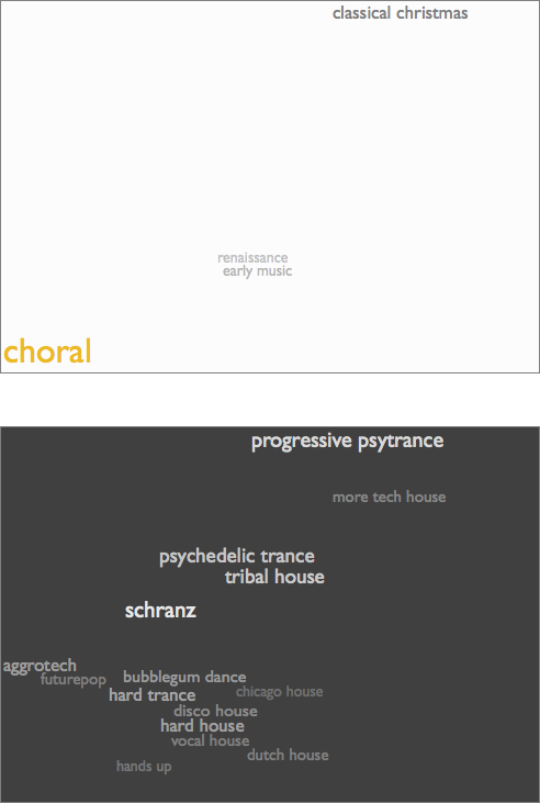
In the nearby map you see that there's very little very close to choral music, but tunnel through the center to the other side of the musical universe and you emerge in a glittering midnight riot of relentless motion. Choral music is cool. But manic psytrance is also cool.
Here are symphonic black metal and straight edge:
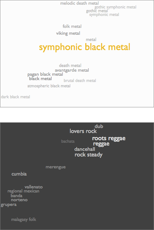
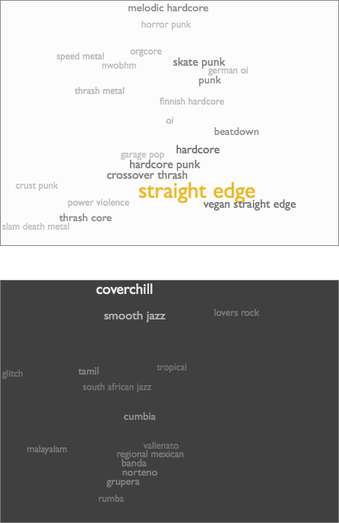
I'd long believed that I simply can't stand anything resembling reggae, but in fact I turn out to like dancehall a lot. And bachata and vallenato are fabulous, and malagasy folk is kind of like a piece of Africa snapped off and went Caribbean. On the other side, "coverchill" is kind of a grimly fascinating convocation of horribleness, but for me glitch is anti-pop comfort music, and Malayalam is not only a trove of Indian pop, but also the only major human language whose name is a palindrome. And the fact that that little cluster of regional Mexican styles is in some sense the opposite of both symphonic black metal and straight edge is a valuable reminder about the subjective nature of even the magnitudes of distinctions.
But of course the opposite of anything is amazing. The opposite of love is still love. Even the idea of opposition is essentially love undergoing introspection. If you tire, for just a moment, of whatever you already adore, all you have to do is try to look inside yourself and overshoot, and there you are amidst a dozen definitively different things gleefully swarming to enthrall you.
[PS: Level four is to discover something we didn't exactly know yet. Level five is to discover how to measure something we didn't know how to know.]
It recently occurred to me to try it a different way. Instead of calculating the furthest genre, I instead take each genre's position in the 12-dimensional analytical space, invert it through the origin of the space, and find the genres closest to that inverted point.
Which sounds delightfully abstruse. "12-dimensional analytical space"! But it just means that I'm trying to produce a computable notion of genre opposition that finds some kind of music that is approximately as conventional or extreme as the genre you started with, but in which every individual aspect we can measure has the opposite polarity. So if we have a genre that's a lot faster and slightly louder and somewhat more electric than the average, I look for a genre that's correspondingly a lot slower and slightly quieter and somewhat more acoustic than the average. Except there are 12 metrics, not just 3, which is hard to picture as a space, but no harder to calculate.
This version also doesn't crash, by which I mean that it crashed a little, of course, until I got the right number of "i"s into all the uses of "audiocentricity", and stopped overwriting function declarations with variables (ah, Python...), but now it doesn't, so that's level one.
There's some subjectivity to the question of whether anything under the heading of "opposite of a genre" makes sense. But when I measure that audiocentricity, or how close things are to the theoretical center of the imaginary space, the highest scoring genres include such definitively mild forms as mellow gold, jam band and soft rock, and the lowest scores go to the most recognizably extreme forms (culminating, again, in choral music). And the opposite of choral music turns out to be schranz, and the opposite of symphonic black metal is roots reggae, and the opposite of straight edge is anonymous bossa nova covers of Sting songs. Which feels like it's onto something. So I'm going to call that good enough for level two.
To help find out whether these opposites are interesting or useful, I've added them to my maps. At the bottom of each individual genre page, where there was already a little inset map of the genre's musical neighbors, there's now also an inverted nightside view of the area of the genre's opposites. E.g. this pair for choral music:
In the nearby map you see that there's very little very close to choral music, but tunnel through the center to the other side of the musical universe and you emerge in a glittering midnight riot of relentless motion. Choral music is cool. But manic psytrance is also cool.
Here are symphonic black metal and straight edge:
I'd long believed that I simply can't stand anything resembling reggae, but in fact I turn out to like dancehall a lot. And bachata and vallenato are fabulous, and malagasy folk is kind of like a piece of Africa snapped off and went Caribbean. On the other side, "coverchill" is kind of a grimly fascinating convocation of horribleness, but for me glitch is anti-pop comfort music, and Malayalam is not only a trove of Indian pop, but also the only major human language whose name is a palindrome. And the fact that that little cluster of regional Mexican styles is in some sense the opposite of both symphonic black metal and straight edge is a valuable reminder about the subjective nature of even the magnitudes of distinctions.
But of course the opposite of anything is amazing. The opposite of love is still love. Even the idea of opposition is essentially love undergoing introspection. If you tire, for just a moment, of whatever you already adore, all you have to do is try to look inside yourself and overshoot, and there you are amidst a dozen definitively different things gleefully swarming to enthrall you.
[PS: Level four is to discover something we didn't exactly know yet. Level five is to discover how to measure something we didn't know how to know.]
¶ Every Number at Once · 7 November 2013 listen/tech
For the past couple months the Echo Nest blog has been running a series of posts about the changing attributes of popular music over time: danceability, energy, tempo, loudness, acousticness, valence, mechanism (how rigidly consistent a song's tempo stays), organism (a combination of acoustic instrumentation and non-rigid human tempo-fluidity) and bounciness (spikiness and dynamic variation vs atmospheric density).
The series was based on what we refer to as my "research". But what this really means is that one night it occurred to me that I had this pile of code for analyzing the aggregate acoustic characteristics of genres (one byproduct of which is Every Noise at Once), and that if I snipped off the part at the beginning that picked sets of songs by genre, I could feed other sets of songs into it and get other analytical slices through the vast Echo Nest database of songs.
Slicing them by year was pretty obviously interesting. But it was only a few minutes of easy work to also get slices by popularity (which we call hotness) and country, so I did those, too.
The obvious question about any of these analyses is: how sure are we that they actually mean anything? The question maybe seems less pressing in cases where the math indicates a trend that we already suspect exists from our regular experience of the world, like songs increasing in drum-machineyness over the decades since the invention of the drum machine. It hangs more heavily over non-trend assertions like our claims that danceability, valence and tempo have stayed relatively constant over time.
The answer is that I'm pretty sure. And the reason is this table:
This shows you the 12 audio metrics I have been measuring, across the four different analytical song-slices and a fifth one in which I fed to the same process sets of similar size that were actually selected randomly. The numbers are discrimination scores*, with higher numbers indicating that a given metric is better at explaining the differences between that kind of slice. So the high 0.840 for danceability/genre means that on the whole genres mostly tend towards internally consistency in danceability, and that the set of genres covers a relative wide range of danceability values. The low 0.106 for danceability/year, on the other hand, means that the songs from a given year don't tend to exhibit any consistent pattern of danceability, and the aggregate scores don't vary much from year to year.
There's like a small picaresque novel in this table, but here are some of the main things I think it suggests:
- All of these metrics are useful for describing and categorizing musical styles. I picked these 12 for that purpose in the first place, of course, so that's not particularly surprising, but it's confirmation that I haven't been totally wasting my time with something irrelevant.
- Tempo is by far the weakest of these metrics for characterizing genres. There are a few reliably slower (new age, classical) and faster (trance, house) genres, of course, but there are a lot of genres that allow both fast and slow songs with equanimity, and the average tempos for most genres hover around the average tempo for music in general.
- The metrics that show the most discriminatory power over time are organism, acousticness and mechanism. This is kind of 2.5 insights, not 3, since my "organism" score is actually a Euclidean combination of acousticness and (inverse) mechanism. It's not news that popular music has gotten more electrified and quantized over time, of course, but it's minor news that I got computers to reach this conclusion through math, and maybe also news that none of the other trends in music are as quantifiably dramatic.
- The subjective impressions that music is getting louder and more energetic over time (these two aren't wholly independent, either, but loudness is only a small component of energy) are supported by numbers.
- None of these metrics show any particularly notable correlation with hotness. That is, popular songs don't tend to be reliably one way or another along any of these dimensions. Which doesn't by any means prove that there isn't a secret formula for the predictable production of pop hits, but it at least doesn't seem to involve a linear combination of these 12 factors.
- The music produced by people from a country tends to be less distinct on aggregate than the music produced within a genre. That is, maybe, the communities we choose tend to have even stronger identities than the communities into which we are born.
- That last thing said, there is still discernible variation between and among countries. The most discriminatory metric here turns out to be bounciness, which I'm pleased to see since that's one I sort of made up myself. For the record, the bounciest countries are Jamaica, the Dominican Republic, Senegal, Ghana and Mali, and the least bouncy are Finland, Sweden and Norway. Although Denmark is bouncier than Viet Nam, and Russia is bouncier than Guatemala, so it's not strictly a function of latitude.
- All the scores for random slices are far lower than the scores for non-random slices. In fact, even the lowest real score (0.053 for tempo/hotness, indicating that popular songs are by and large no faster or slower than unknown or unpopular songs) is higher than the highest random score. So that gives us a baseline confidence that both the metrics and the non-random slices are registering genuine variation. And helps explain why efficient music discovery is a more complicated problem than "pick a random song that exists and see if you like it".
* For those of you who care, here's how these discrimination scores work. For each metric/slice combination I calculated both the mean and standard deviation across a few thousand relevant songs from Echo Nest data (we have a lot of data, including detailed audio analysis for something like 250 million tracks). The genre slice has more than 700 genres, I used the 64 years from 1950 to 2013, hotness was done in 80 buckets, there were 97 countries for which we had a critical mass of data, and the random slice used 26 random buckets. I then took the standard deviation of the average values for the slice (so a wider spread of averages across the genres/years/whatever means more discrimination) and divided by the average of the standard deviations (so tighter ranges of values within each genre/year/whatever means more discrimination). I feel like I probably didn't invent this, but I couldn't easily find any evidence of its previous existence online.
[And because it seems sad to have a thing about music without some actual music to listen to, I leave you with The Sound of Everything, my autogenerated genre-overview playlist, which has one song for every genre we track, in alphabetical order by genre-name. This grows and changes as the genre map expands, but as of 7 November 2013 it has 756 songs for a total running time of 55:29:28. And that's just one song per genre. Almost any one of these genres could consume your entire life. (Almost. There are some exceptions.)]
[As of 20 May 2016 it has 1454 songs and lasts 105 hours.]
The series was based on what we refer to as my "research". But what this really means is that one night it occurred to me that I had this pile of code for analyzing the aggregate acoustic characteristics of genres (one byproduct of which is Every Noise at Once), and that if I snipped off the part at the beginning that picked sets of songs by genre, I could feed other sets of songs into it and get other analytical slices through the vast Echo Nest database of songs.
Slicing them by year was pretty obviously interesting. But it was only a few minutes of easy work to also get slices by popularity (which we call hotness) and country, so I did those, too.
The obvious question about any of these analyses is: how sure are we that they actually mean anything? The question maybe seems less pressing in cases where the math indicates a trend that we already suspect exists from our regular experience of the world, like songs increasing in drum-machineyness over the decades since the invention of the drum machine. It hangs more heavily over non-trend assertions like our claims that danceability, valence and tempo have stayed relatively constant over time.
The answer is that I'm pretty sure. And the reason is this table:
| # | metric | genre | year | hotness | country | random |
| 1 | danceability | 0.840 | 0.106 | 0.112 | 0.279 | 0.038 |
| 2 | energy | 0.882 | 0.552 | 0.112 | 0.200 | 0.016 |
| 3 | tempo | 0.321 | 0.140 | 0.053 | 0.111 | 0.020 |
| 4 | loudness | 0.897 | 0.474 | 0.125 | 0.183 | 0.020 |
| 5 | acousticness | 0.958 | 0.713 | 0.161 | 0.242 | 0.019 |
| 6 | valence | 0.601 | 0.102 | 0.075 | 0.334 | 0.030 |
| 7 | dynamic range | 0.932 | 0.332 | 0.175 | 0.347 | 0.031 |
| 8 | flatness | 0.681 | 0.319 | 0.143 | 0.168 | 0.020 |
| 9 | beat strength | 0.819 | 0.201 | 0.129 | 0.282 | 0.038 |
| 10 | mechanism | 0.870 | 0.636 | 0.111 | 0.199 | 0.024 |
| 11 | organism | 0.961 | 0.746 | 0.137 | 0.225 | 0.023 |
| 12 | bounciness | 0.911 | 0.274 | 0.159 | 0.329 | 0.033 |
This shows you the 12 audio metrics I have been measuring, across the four different analytical song-slices and a fifth one in which I fed to the same process sets of similar size that were actually selected randomly. The numbers are discrimination scores*, with higher numbers indicating that a given metric is better at explaining the differences between that kind of slice. So the high 0.840 for danceability/genre means that on the whole genres mostly tend towards internally consistency in danceability, and that the set of genres covers a relative wide range of danceability values. The low 0.106 for danceability/year, on the other hand, means that the songs from a given year don't tend to exhibit any consistent pattern of danceability, and the aggregate scores don't vary much from year to year.
There's like a small picaresque novel in this table, but here are some of the main things I think it suggests:
- All of these metrics are useful for describing and categorizing musical styles. I picked these 12 for that purpose in the first place, of course, so that's not particularly surprising, but it's confirmation that I haven't been totally wasting my time with something irrelevant.
- Tempo is by far the weakest of these metrics for characterizing genres. There are a few reliably slower (new age, classical) and faster (trance, house) genres, of course, but there are a lot of genres that allow both fast and slow songs with equanimity, and the average tempos for most genres hover around the average tempo for music in general.
- The metrics that show the most discriminatory power over time are organism, acousticness and mechanism. This is kind of 2.5 insights, not 3, since my "organism" score is actually a Euclidean combination of acousticness and (inverse) mechanism. It's not news that popular music has gotten more electrified and quantized over time, of course, but it's minor news that I got computers to reach this conclusion through math, and maybe also news that none of the other trends in music are as quantifiably dramatic.
- The subjective impressions that music is getting louder and more energetic over time (these two aren't wholly independent, either, but loudness is only a small component of energy) are supported by numbers.
- None of these metrics show any particularly notable correlation with hotness. That is, popular songs don't tend to be reliably one way or another along any of these dimensions. Which doesn't by any means prove that there isn't a secret formula for the predictable production of pop hits, but it at least doesn't seem to involve a linear combination of these 12 factors.
- The music produced by people from a country tends to be less distinct on aggregate than the music produced within a genre. That is, maybe, the communities we choose tend to have even stronger identities than the communities into which we are born.
- That last thing said, there is still discernible variation between and among countries. The most discriminatory metric here turns out to be bounciness, which I'm pleased to see since that's one I sort of made up myself. For the record, the bounciest countries are Jamaica, the Dominican Republic, Senegal, Ghana and Mali, and the least bouncy are Finland, Sweden and Norway. Although Denmark is bouncier than Viet Nam, and Russia is bouncier than Guatemala, so it's not strictly a function of latitude.
- All the scores for random slices are far lower than the scores for non-random slices. In fact, even the lowest real score (0.053 for tempo/hotness, indicating that popular songs are by and large no faster or slower than unknown or unpopular songs) is higher than the highest random score. So that gives us a baseline confidence that both the metrics and the non-random slices are registering genuine variation. And helps explain why efficient music discovery is a more complicated problem than "pick a random song that exists and see if you like it".
* For those of you who care, here's how these discrimination scores work. For each metric/slice combination I calculated both the mean and standard deviation across a few thousand relevant songs from Echo Nest data (we have a lot of data, including detailed audio analysis for something like 250 million tracks). The genre slice has more than 700 genres, I used the 64 years from 1950 to 2013, hotness was done in 80 buckets, there were 97 countries for which we had a critical mass of data, and the random slice used 26 random buckets. I then took the standard deviation of the average values for the slice (so a wider spread of averages across the genres/years/whatever means more discrimination) and divided by the average of the standard deviations (so tighter ranges of values within each genre/year/whatever means more discrimination). I feel like I probably didn't invent this, but I couldn't easily find any evidence of its previous existence online.
[And because it seems sad to have a thing about music without some actual music to listen to, I leave you with The Sound of Everything, my autogenerated genre-overview playlist, which has one song for every genre we track, in alphabetical order by genre-name. This grows and changes as the genre map expands, but as of 7 November 2013 it has 756 songs for a total running time of 55:29:28. And that's just one song per genre. Almost any one of these genres could consume your entire life. (Almost. There are some exceptions.)]
[As of 20 May 2016 it has 1454 songs and lasts 105 hours.]
¶ Is This Band Name Taken? · 18 October 2013 listen/tech
Forming a band? About to pick a name for it? Help the world out and visit this first:
IS THIS BAND NAME TAKEN?
IS THIS BAND NAME TAKEN?
¶ The Minor Fall, the Major Lift · 13 October 2013 listen/tech
Here's another little postscript to The Unbearable Sadness of Pop Songs, in which I examined The Echo Nest's statistical evidence for Glenn Schellenberg's contention that popular music is getting sadder.
Schellenberg used (primarily) minor keys as a representational proxy for sadness, and in his small data set found that minor-key usage in pop hits increased dramatically over the last 50 years. In our much larger data set this trend was arguably present, but very slight.
But is this underlying minor=sad premise itself even right? It's a customary qualitative observation that minor keys mean sadness, but does that idea hold up quantitatively?
At The Echo Nest our audio analysis of hundreds of millions of songs includes computational attempts to measure both semi-objective things like tempo and loudness and major/minor, and wholly subjective things like danceability and energy and happy/sad valence. The subjective ones are done by using machine-learning to extrapolate from human training data, so we're not relying on computers to spontaneously develop emotional responses to music of their own volition.
We can analyze these variables at the level of individual songs, but the amount of variability there is naturally high, and the results are difficult to appreciate in aggregate, so for both statistical and comprehensibility reasons it's maybe more interesting to analyze them at the aggregate level of kinds of music.
Here, for example, is an XY scatter-plot of our 700+ music genres according to their aggregate valence (up is happier, down is sadder) and energy (left is calmer, right is more agitated).
valence/energy
Moving up and right from the bottom left corner we do see a pattern of classical and traditional genres getting both more energetic and happier. After that, though, things get more complicated. As forms get really highly energetic, they tend to get subjectively darker. Not sadder, exactly, but angrier: rock, punk and metal end up down in the bottom right. Perpendicular to this, more or less, we see a bunch of latin and hip-hop forms going upwards, getting happier or more positive in mood without getting a lot more energetic. And towards the top left are a bunch of forms that are more positive on calculated aggregate despite having lower aggregate energy. Intriguingly, this last set includes a bunch of blues forms, which you might expect to have low valences, because "blues" is inherently about sadness, right? But our data suggest otherwise, and if "blues" is really music created in reaction to hardship, then maybe this is actually what we should have expected.
For a clearer demonstration of correlation, here's a plot of valence against "bounciness", an experimental analytical measure of rhythmic intensity (dense, atmospheric music is less bouncy; spikier music with sharper and stronger beats is more bouncy).
valence/bounciness
Again up is happier and down is sadder/angrier. Left is less bouncy, right is more bouncy. At the bottom left we see a bunch of drone and dense metal forms that are both dark and highly unbouncy. Moving up and right we find a pretty reliably consistent diagonal pattern of increased bounciness leading to increasingly positive emotional reactions, and the densest cloud of forms even shifts up and rightwards more sharply after the middle of the world, leading to things like soca and reggae and merengue that are highly upbeat in both the rhythmic and emotional senses. The "beat" in "upbeat" is not a linguistic anomaly.
But here is the plot of valence versus minor/major keys.
valence/majority
Left means more songs in minor keys, right means fewer. If minor keys meant sadness as axiomatically as we conventionally believe, this plot should be a thick diagonal line from the bottom left (more minor-key songs means more sadness) to the top right (fewer minor-key songs, more happiness). As you can see, this is rather evidently not the case. In fact, the main thing we see here is a dense vertical axis of forms that cover the span of emotional valences despite having about the same prevalences of minor keys. There's also a notable line of country forms that get more and more exclusively major-key without getting any collectively happier. And although there's a generous scattering of roots-oriented forms up in the top-right quadrant where we expected major-key dominance to correlate with more positive moods, they're a relative overall minority, and arguably the southeasterly diagonal within them is as apparent as the northeasterly diagonal we were trying to stipulate.
None of this should be taken to end this discussion. Measuring emotional responses is hard, and one could reasonably wonder whether these plots reveal some systematic tendency of our algorithms to underrate the subjective sadness of the blues. In multiple iterations we haven't yet found this to be the case, but that doesn't prove it isn't so.
Or, maybe even more interestingly, it might be that human listeners report their emotional responses in systematically different ways than we feel them. Basing computational aesthetics on human self-awareness is maybe not all that much more reliable than basing it on computer self-awareness, and maybe we'll have to wait until computers wake up to be able to find out if they'll know themselves better than we know ourselves.
Or, maybe, this old simplistic minor=sadness thing is just kind of wrong.
Schellenberg used (primarily) minor keys as a representational proxy for sadness, and in his small data set found that minor-key usage in pop hits increased dramatically over the last 50 years. In our much larger data set this trend was arguably present, but very slight.
But is this underlying minor=sad premise itself even right? It's a customary qualitative observation that minor keys mean sadness, but does that idea hold up quantitatively?
At The Echo Nest our audio analysis of hundreds of millions of songs includes computational attempts to measure both semi-objective things like tempo and loudness and major/minor, and wholly subjective things like danceability and energy and happy/sad valence. The subjective ones are done by using machine-learning to extrapolate from human training data, so we're not relying on computers to spontaneously develop emotional responses to music of their own volition.
We can analyze these variables at the level of individual songs, but the amount of variability there is naturally high, and the results are difficult to appreciate in aggregate, so for both statistical and comprehensibility reasons it's maybe more interesting to analyze them at the aggregate level of kinds of music.
Here, for example, is an XY scatter-plot of our 700+ music genres according to their aggregate valence (up is happier, down is sadder) and energy (left is calmer, right is more agitated).

valence/energy
Moving up and right from the bottom left corner we do see a pattern of classical and traditional genres getting both more energetic and happier. After that, though, things get more complicated. As forms get really highly energetic, they tend to get subjectively darker. Not sadder, exactly, but angrier: rock, punk and metal end up down in the bottom right. Perpendicular to this, more or less, we see a bunch of latin and hip-hop forms going upwards, getting happier or more positive in mood without getting a lot more energetic. And towards the top left are a bunch of forms that are more positive on calculated aggregate despite having lower aggregate energy. Intriguingly, this last set includes a bunch of blues forms, which you might expect to have low valences, because "blues" is inherently about sadness, right? But our data suggest otherwise, and if "blues" is really music created in reaction to hardship, then maybe this is actually what we should have expected.
For a clearer demonstration of correlation, here's a plot of valence against "bounciness", an experimental analytical measure of rhythmic intensity (dense, atmospheric music is less bouncy; spikier music with sharper and stronger beats is more bouncy).

valence/bounciness
Again up is happier and down is sadder/angrier. Left is less bouncy, right is more bouncy. At the bottom left we see a bunch of drone and dense metal forms that are both dark and highly unbouncy. Moving up and right we find a pretty reliably consistent diagonal pattern of increased bounciness leading to increasingly positive emotional reactions, and the densest cloud of forms even shifts up and rightwards more sharply after the middle of the world, leading to things like soca and reggae and merengue that are highly upbeat in both the rhythmic and emotional senses. The "beat" in "upbeat" is not a linguistic anomaly.
But here is the plot of valence versus minor/major keys.

valence/majority
Left means more songs in minor keys, right means fewer. If minor keys meant sadness as axiomatically as we conventionally believe, this plot should be a thick diagonal line from the bottom left (more minor-key songs means more sadness) to the top right (fewer minor-key songs, more happiness). As you can see, this is rather evidently not the case. In fact, the main thing we see here is a dense vertical axis of forms that cover the span of emotional valences despite having about the same prevalences of minor keys. There's also a notable line of country forms that get more and more exclusively major-key without getting any collectively happier. And although there's a generous scattering of roots-oriented forms up in the top-right quadrant where we expected major-key dominance to correlate with more positive moods, they're a relative overall minority, and arguably the southeasterly diagonal within them is as apparent as the northeasterly diagonal we were trying to stipulate.
None of this should be taken to end this discussion. Measuring emotional responses is hard, and one could reasonably wonder whether these plots reveal some systematic tendency of our algorithms to underrate the subjective sadness of the blues. In multiple iterations we haven't yet found this to be the case, but that doesn't prove it isn't so.
Or, maybe even more interestingly, it might be that human listeners report their emotional responses in systematically different ways than we feel them. Basing computational aesthetics on human self-awareness is maybe not all that much more reliable than basing it on computer self-awareness, and maybe we'll have to wait until computers wake up to be able to find out if they'll know themselves better than we know ourselves.
Or, maybe, this old simplistic minor=sadness thing is just kind of wrong.
¶ A Retromatic History of Music (or Love) · 11 October 2013 listen/tech
At work we have a lot of data about music popularity, and a growing amount of data about music genres, and a lot of data about time. Periodically some new way of combining these occurs to me.
This week's is A Retromatic History of Music (or Love).
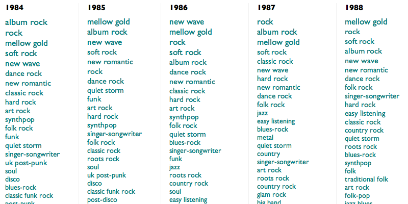
This is an algorithmically-generated retroactive history of popular music. It is calculated by taking the 5000 most durably popular songs from each year since 1950 (using The Echo Nest's best guesses at both popularity and year), finding the genres to which their artists correspond (sometimes in hindsight), and then ranking those genres according to the fraction of that year's artists they each represent. This process is neither wholly accurate nor wholly precise, but neither is music, yet they both often seem to work.
And although what results is wildly unglamorous in structure (it scrolls sideways!), and in some places obvious or dubious or both, maybe it's also one of these halting, anxious ways the computers have of trying to tell us that they understand not only what we love, but that we love.
(For extra fun, use Control-F in your browser to highlight the rise and fall of particular genres.)
This week's is A Retromatic History of Music (or Love).
This is an algorithmically-generated retroactive history of popular music. It is calculated by taking the 5000 most durably popular songs from each year since 1950 (using The Echo Nest's best guesses at both popularity and year), finding the genres to which their artists correspond (sometimes in hindsight), and then ranking those genres according to the fraction of that year's artists they each represent. This process is neither wholly accurate nor wholly precise, but neither is music, yet they both often seem to work.
And although what results is wildly unglamorous in structure (it scrolls sideways!), and in some places obvious or dubious or both, maybe it's also one of these halting, anxious ways the computers have of trying to tell us that they understand not only what we love, but that we love.
(For extra fun, use Control-F in your browser to highlight the rise and fall of particular genres.)
¶ The Unbearable Sadness of Pop Songs · 27 September 2013 listen/tech
In a BBC piece last week about sad music, University of Toronto professor E. Glenn Schellenberg talked about his research into sad songs over time. His observations come from the paper Emotional Cues in American Popular Music: Five Decades of the Top 40, in which he and Christian von Scheve studied (mainly) the tempo and mode of popular songs, found that over time popular songs have gotten slower and increasingly in minor keys, and equated slower and minor with sadness.
The qualitative part of this, "sadness", is fairly subjective and notoriously difficult to measure. But the quantitative part is easier. Schellenberg's study used a pretty small sample of music, though: only the top 40 songs from each year, aggregated at the decade level, and only actually five years from each decade, for a total of only about 1000 songs in the entire study.
At The Echo Nest we have key and tempo data for about 18 million songs from 1960 to 2013. I recently did a breakdown of tempo over time, in fact, and what I found from this larger sample doesn't match Schellenberg's pattern or support his contention that popular songs are getting slower.
His stronger claim, though, is that more popular songs are now in minor keys, or maybe that more minor-key songs are now popular. The paper dramatically claims that 85% of the 60s hits were in a major key, whereas only 42.5% of the hits from the 2000s were in a major key.
I hadn't looked at mode over time, previously, but it took only a couple minutes to run those numbers. They aren't nearly as dramatic as Schellenberg's.
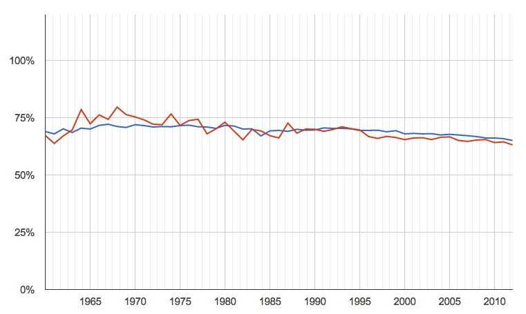
percentage of songs in major keys, by year (blue is all songs for which we have data, red is just the most popular)
The recent trend is down, but only very slightly, and certainly nowhere near the dramatic 85% to 42.5% in the paper. Taking only the smaller number of most popular songs produces more variability, naturally, but not a significantly different pattern.
The saddest part of the paper, though, was not the numbers but a plaintive note that it came about in part because, in a previous study, the authors found that "clearly happy-sounding excerpts from recent popular recordings were particularly difficult to locate". If there's one thing the modern age is trying earnestly to give us, it's the ability to "locate songs". So here is a quick auto-generated list, from Echo Nest data, of maybe-happy modern popular songs. Subjectivity endures, so your reactions to any individual song may vary, but surely there is something here to extricate you from the supposedly-inexorable enveloping sadness for at least a few minutes.
PS: Later it occurred to me to also run this analysis sliced by popularity, independent of year. That is, are current popularity and mode correlated across our entire universe of songs? No. No, they are not.

¶ When You Run Out of What You Know · 23 September 2013 listen/tech
An NPR piece on Friday, in response to a request by a self-described fan of "sad, beardy indie-rock" for something more upbeat, asked Where Do Mopey Music Fans Turn When They Need Energy?
NPR's Stephen Thompson took a shot at recommending a few bands himself (Andrew W.K., The Polyphonic Spree, Cloud Cult, Mates of State, Jonsi), and invited other suggestions from readers, who added lots (with multiple mentions of Frightened Rabbit, Vampire Weekend, The Go! Team and CHVRCHES). Thoughtful individual suggestions from actual people are a pretty decent way to find new music. (And Frightened Rabbit and CHVRCHES are both really great.)
But we also have computers, and data-alchemized suggestions computed from the aggregate music activities of the people of Earth are another pretty decent way to find new music. So here, instead of just a few more band-names to answer a particular inquiry, are 5 data-driven paths for exploration that might help you answer questions like this for yourself:
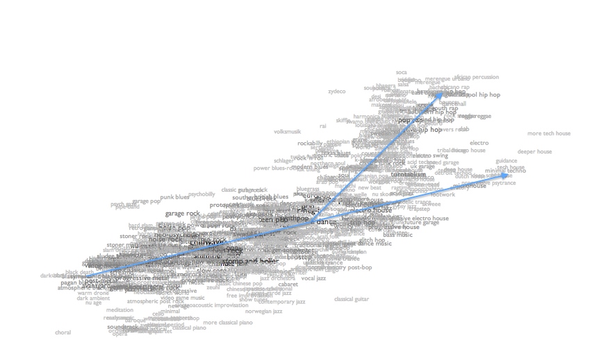
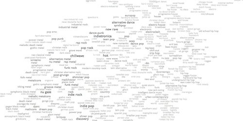
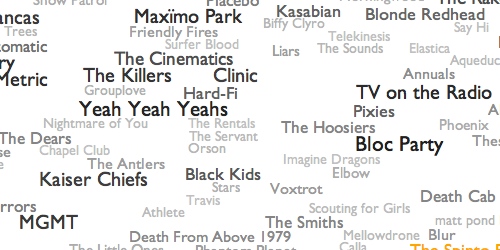 1. How well do you know what you know? Before we start exploring alternatives, here's an overview map of what "indie rock" means to The Echo Nest. Maybe not all of this sad music is quite as mopey as you thought. Maybe some of this notion of indie rock is stuff you didn't know. Click around and see what you find. Higher energy tends to be up and to the right, although of course generally-mellow bands can have highly energetic individual songs, and vice versa. Or try "scan" or "radiate" at the top of the map to fly you around on a random tour. Or try the ENtro to indie rock, my algorithmic data-driven attempt at a canonical overview playlist for the genre.
2. Let me push some levers. At The Echo Nest we calculate a bunch of scores for every song, among them "danceability", "energy" and an experimental mood metric called "valence". With these I can take any genre and produce the "upbeat" version of it, picking only songs that are above the genre's average on all three of those scores. Here are the results for "upbeat indie rock". Whether any individual song or band appeals to you is a personal decision, of course, but that playlist has 344 ideas across 21 hours, so hopefully some of them will lead you somewhere for a few minutes.
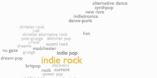
3. Creep past your borders. At the bottom of the "indie rock" splattergraph from #1 is a map of similar genres. Higher energy is up and to the right, so the obvious stepping-stone path to try would be indie pop to dance-punk to indietronica to new rave to synthpop to alternative dance. Each of those steps is another whole world to explore, but they overlap and shift as you move from one to another, so maybe this is how you can find your way to somewhere new without ever feeling like you're being flung out of the world of what you already know.

4. But sometimes the nagging feeling of slight dissatisfaction with what you know is your heart's way of hinting that there are wonderful things you've never even dreamed. Edging from related genre to related genre is prudent, and not necessarily unexciting, but it assumes that "related" and "prudent" are required qualities, and maybe they are not. You are not constrained by your past choices. Indie rock is not the only principled music in the world. What about math pop, where guitars ping around like blades of Calder mobiles, or c86, where they chime and chirp like besweatered birds? What about noise pop, where the electricity becomes audible, or punk blues, where it starts to fray? What about chinese indie rock, where you can hear a culture still figuring out for itself what it means to express dissent and moral conviction in music, or swedish punk, where you can hear how a different one imported and adapted that dissent to their own climate? Frightened Rabbit and CHVRCHES are from Scotland, which is close to the Faroe Islands. Or maybe you have totally underestimated your tolerance for extravagance, and the frenetic dance exhortations of bouncy house or the epic anthems of gothic symphonic metal would open your world in ways you didn't know to want.
5. But the larger horizon towards which all these paths point is that this is a question you can best and most joyously answer for yourself. Unfold the map. You don't need me to point to places on it. Just click somewhere. Maybe you need to be flung out of what you know. The world is full of music, more full than you have probably realized even if you thought you knew that already. So go explore a little. It's easy, and it's free (or it's $10/month for Rdio, at most, which is about the same as free compared to what it used to cost to "explore" music). Play some sounds from categories you've never before seen on lists. Hear what people sound like in places you had never thought about visiting. Hear what the tiny things you think you hate turn into when somebody embraces them as the grandest truth. Hear new cults forming, or just let the currents whirl you through everything.
Music is the thing that humans do best. That moment, when you run out of what you know? That is the moment before the great moment when you set out on the journey that will take you to find your next helpless astonishing love. That moment is the tiny, precious, terrible silence before music fills all of the air, before you realize that music is why the air is even there.
NPR's Stephen Thompson took a shot at recommending a few bands himself (Andrew W.K., The Polyphonic Spree, Cloud Cult, Mates of State, Jonsi), and invited other suggestions from readers, who added lots (with multiple mentions of Frightened Rabbit, Vampire Weekend, The Go! Team and CHVRCHES). Thoughtful individual suggestions from actual people are a pretty decent way to find new music. (And Frightened Rabbit and CHVRCHES are both really great.)
But we also have computers, and data-alchemized suggestions computed from the aggregate music activities of the people of Earth are another pretty decent way to find new music. So here, instead of just a few more band-names to answer a particular inquiry, are 5 data-driven paths for exploration that might help you answer questions like this for yourself:
1. How well do you know what you know? Before we start exploring alternatives, here's an overview map of what "indie rock" means to The Echo Nest. Maybe not all of this sad music is quite as mopey as you thought. Maybe some of this notion of indie rock is stuff you didn't know. Click around and see what you find. Higher energy tends to be up and to the right, although of course generally-mellow bands can have highly energetic individual songs, and vice versa. Or try "scan" or "radiate" at the top of the map to fly you around on a random tour. Or try the ENtro to indie rock, my algorithmic data-driven attempt at a canonical overview playlist for the genre.
2. Let me push some levers. At The Echo Nest we calculate a bunch of scores for every song, among them "danceability", "energy" and an experimental mood metric called "valence". With these I can take any genre and produce the "upbeat" version of it, picking only songs that are above the genre's average on all three of those scores. Here are the results for "upbeat indie rock". Whether any individual song or band appeals to you is a personal decision, of course, but that playlist has 344 ideas across 21 hours, so hopefully some of them will lead you somewhere for a few minutes.
3. Creep past your borders. At the bottom of the "indie rock" splattergraph from #1 is a map of similar genres. Higher energy is up and to the right, so the obvious stepping-stone path to try would be indie pop to dance-punk to indietronica to new rave to synthpop to alternative dance. Each of those steps is another whole world to explore, but they overlap and shift as you move from one to another, so maybe this is how you can find your way to somewhere new without ever feeling like you're being flung out of the world of what you already know.
4. But sometimes the nagging feeling of slight dissatisfaction with what you know is your heart's way of hinting that there are wonderful things you've never even dreamed. Edging from related genre to related genre is prudent, and not necessarily unexciting, but it assumes that "related" and "prudent" are required qualities, and maybe they are not. You are not constrained by your past choices. Indie rock is not the only principled music in the world. What about math pop, where guitars ping around like blades of Calder mobiles, or c86, where they chime and chirp like besweatered birds? What about noise pop, where the electricity becomes audible, or punk blues, where it starts to fray? What about chinese indie rock, where you can hear a culture still figuring out for itself what it means to express dissent and moral conviction in music, or swedish punk, where you can hear how a different one imported and adapted that dissent to their own climate? Frightened Rabbit and CHVRCHES are from Scotland, which is close to the Faroe Islands. Or maybe you have totally underestimated your tolerance for extravagance, and the frenetic dance exhortations of bouncy house or the epic anthems of gothic symphonic metal would open your world in ways you didn't know to want.
5. But the larger horizon towards which all these paths point is that this is a question you can best and most joyously answer for yourself. Unfold the map. You don't need me to point to places on it. Just click somewhere. Maybe you need to be flung out of what you know. The world is full of music, more full than you have probably realized even if you thought you knew that already. So go explore a little. It's easy, and it's free (or it's $10/month for Rdio, at most, which is about the same as free compared to what it used to cost to "explore" music). Play some sounds from categories you've never before seen on lists. Hear what people sound like in places you had never thought about visiting. Hear what the tiny things you think you hate turn into when somebody embraces them as the grandest truth. Hear new cults forming, or just let the currents whirl you through everything.
Music is the thing that humans do best. That moment, when you run out of what you know? That is the moment before the great moment when you set out on the journey that will take you to find your next helpless astonishing love. That moment is the tiny, precious, terrible silence before music fills all of the air, before you realize that music is why the air is even there.
¶ SXSW 2014 Voting · 19 August 2013 listen/tech
I submitted a proposal for a talk on genres and music discovery at South by Southwest next March. 30% of the selection criteria for talks is open voting, which has now begun. If you like music, freedom, goodness or humanity, you should go vote for me right now, and then encourage all your friends and enemies to do this too.
