
27 September 2013 to 18 April 2013
¶ The Unbearable Sadness of Pop Songs · 27 September 2013 listen/tech
In a BBC piece last week about sad music, University of Toronto professor E. Glenn Schellenberg talked about his research into sad songs over time. His observations come from the paper Emotional Cues in American Popular Music: Five Decades of the Top 40, in which he and Christian von Scheve studied (mainly) the tempo and mode of popular songs, found that over time popular songs have gotten slower and increasingly in minor keys, and equated slower and minor with sadness.
The qualitative part of this, "sadness", is fairly subjective and notoriously difficult to measure. But the quantitative part is easier. Schellenberg's study used a pretty small sample of music, though: only the top 40 songs from each year, aggregated at the decade level, and only actually five years from each decade, for a total of only about 1000 songs in the entire study.
At The Echo Nest we have key and tempo data for about 18 million songs from 1960 to 2013. I recently did a breakdown of tempo over time, in fact, and what I found from this larger sample doesn't match Schellenberg's pattern or support his contention that popular songs are getting slower.
His stronger claim, though, is that more popular songs are now in minor keys, or maybe that more minor-key songs are now popular. The paper dramatically claims that 85% of the 60s hits were in a major key, whereas only 42.5% of the hits from the 2000s were in a major key.
I hadn't looked at mode over time, previously, but it took only a couple minutes to run those numbers. They aren't nearly as dramatic as Schellenberg's.
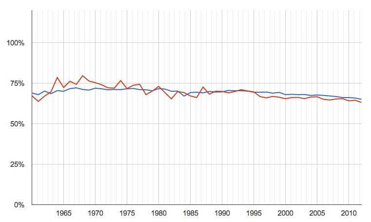
percentage of songs in major keys, by year (blue is all songs for which we have data, red is just the most popular)
The recent trend is down, but only very slightly, and certainly nowhere near the dramatic 85% to 42.5% in the paper. Taking only the smaller number of most popular songs produces more variability, naturally, but not a significantly different pattern.
The saddest part of the paper, though, was not the numbers but a plaintive note that it came about in part because, in a previous study, the authors found that "clearly happy-sounding excerpts from recent popular recordings were particularly difficult to locate". If there's one thing the modern age is trying earnestly to give us, it's the ability to "locate songs". So here is a quick auto-generated list, from Echo Nest data, of maybe-happy modern popular songs. Subjectivity endures, so your reactions to any individual song may vary, but surely there is something here to extricate you from the supposedly-inexorable enveloping sadness for at least a few minutes.
PS: Later it occurred to me to also run this analysis sliced by popularity, independent of year. That is, are current popularity and mode correlated across our entire universe of songs? No. No, they are not.

¶ When You Run Out of What You Know · 23 September 2013 listen/tech
An NPR piece on Friday, in response to a request by a self-described fan of "sad, beardy indie-rock" for something more upbeat, asked Where Do Mopey Music Fans Turn When They Need Energy?
NPR's Stephen Thompson took a shot at recommending a few bands himself (Andrew W.K., The Polyphonic Spree, Cloud Cult, Mates of State, Jonsi), and invited other suggestions from readers, who added lots (with multiple mentions of Frightened Rabbit, Vampire Weekend, The Go! Team and CHVRCHES). Thoughtful individual suggestions from actual people are a pretty decent way to find new music. (And Frightened Rabbit and CHVRCHES are both really great.)
But we also have computers, and data-alchemized suggestions computed from the aggregate music activities of the people of Earth are another pretty decent way to find new music. So here, instead of just a few more band-names to answer a particular inquiry, are 5 data-driven paths for exploration that might help you answer questions like this for yourself:
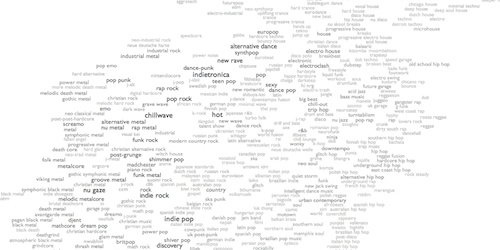
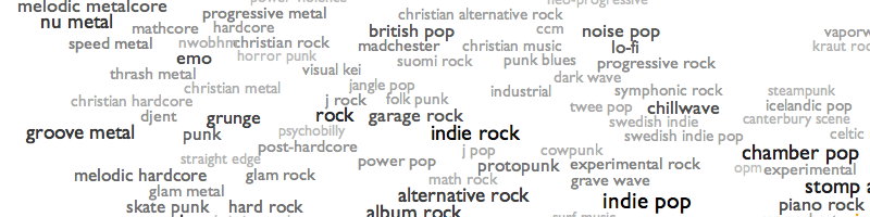
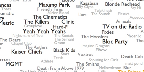 1. How well do you know what you know? Before we start exploring alternatives, here's an overview map of what "indie rock" means to The Echo Nest. Maybe not all of this sad music is quite as mopey as you thought. Maybe some of this notion of indie rock is stuff you didn't know. Click around and see what you find. Higher energy tends to be up and to the right, although of course generally-mellow bands can have highly energetic individual songs, and vice versa. Or try "scan" or "radiate" at the top of the map to fly you around on a random tour. Or try the ENtro to indie rock, my algorithmic data-driven attempt at a canonical overview playlist for the genre.
2. Let me push some levers. At The Echo Nest we calculate a bunch of scores for every song, among them "danceability", "energy" and an experimental mood metric called "valence". With these I can take any genre and produce the "upbeat" version of it, picking only songs that are above the genre's average on all three of those scores. Here are the results for "upbeat indie rock". Whether any individual song or band appeals to you is a personal decision, of course, but that playlist has 344 ideas across 21 hours, so hopefully some of them will lead you somewhere for a few minutes.
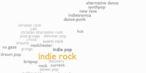
3. Creep past your borders. At the bottom of the "indie rock" splattergraph from #1 is a map of similar genres. Higher energy is up and to the right, so the obvious stepping-stone path to try would be indie pop to dance-punk to indietronica to new rave to synthpop to alternative dance. Each of those steps is another whole world to explore, but they overlap and shift as you move from one to another, so maybe this is how you can find your way to somewhere new without ever feeling like you're being flung out of the world of what you already know.

4. But sometimes the nagging feeling of slight dissatisfaction with what you know is your heart's way of hinting that there are wonderful things you've never even dreamed. Edging from related genre to related genre is prudent, and not necessarily unexciting, but it assumes that "related" and "prudent" are required qualities, and maybe they are not. You are not constrained by your past choices. Indie rock is not the only principled music in the world. What about math pop, where guitars ping around like blades of Calder mobiles, or c86, where they chime and chirp like besweatered birds? What about noise pop, where the electricity becomes audible, or punk blues, where it starts to fray? What about chinese indie rock, where you can hear a culture still figuring out for itself what it means to express dissent and moral conviction in music, or swedish punk, where you can hear how a different one imported and adapted that dissent to their own climate? Frightened Rabbit and CHVRCHES are from Scotland, which is close to the Faroe Islands. Or maybe you have totally underestimated your tolerance for extravagance, and the frenetic dance exhortations of bouncy house or the epic anthems of gothic symphonic metal would open your world in ways you didn't know to want.
5. But the larger horizon towards which all these paths point is that this is a question you can best and most joyously answer for yourself. Unfold the map. You don't need me to point to places on it. Just click somewhere. Maybe you need to be flung out of what you know. The world is full of music, more full than you have probably realized even if you thought you knew that already. So go explore a little. It's easy, and it's free (or it's $10/month for Rdio, at most, which is about the same as free compared to what it used to cost to "explore" music). Play some sounds from categories you've never before seen on lists. Hear what people sound like in places you had never thought about visiting. Hear what the tiny things you think you hate turn into when somebody embraces them as the grandest truth. Hear new cults forming, or just let the currents whirl you through everything.
Music is the thing that humans do best. That moment, when you run out of what you know? That is the moment before the great moment when you set out on the journey that will take you to find your next helpless astonishing love. That moment is the tiny, precious, terrible silence before music fills all of the air, before you realize that music is why the air is even there.
NPR's Stephen Thompson took a shot at recommending a few bands himself (Andrew W.K., The Polyphonic Spree, Cloud Cult, Mates of State, Jonsi), and invited other suggestions from readers, who added lots (with multiple mentions of Frightened Rabbit, Vampire Weekend, The Go! Team and CHVRCHES). Thoughtful individual suggestions from actual people are a pretty decent way to find new music. (And Frightened Rabbit and CHVRCHES are both really great.)
But we also have computers, and data-alchemized suggestions computed from the aggregate music activities of the people of Earth are another pretty decent way to find new music. So here, instead of just a few more band-names to answer a particular inquiry, are 5 data-driven paths for exploration that might help you answer questions like this for yourself:
1. How well do you know what you know? Before we start exploring alternatives, here's an overview map of what "indie rock" means to The Echo Nest. Maybe not all of this sad music is quite as mopey as you thought. Maybe some of this notion of indie rock is stuff you didn't know. Click around and see what you find. Higher energy tends to be up and to the right, although of course generally-mellow bands can have highly energetic individual songs, and vice versa. Or try "scan" or "radiate" at the top of the map to fly you around on a random tour. Or try the ENtro to indie rock, my algorithmic data-driven attempt at a canonical overview playlist for the genre.
2. Let me push some levers. At The Echo Nest we calculate a bunch of scores for every song, among them "danceability", "energy" and an experimental mood metric called "valence". With these I can take any genre and produce the "upbeat" version of it, picking only songs that are above the genre's average on all three of those scores. Here are the results for "upbeat indie rock". Whether any individual song or band appeals to you is a personal decision, of course, but that playlist has 344 ideas across 21 hours, so hopefully some of them will lead you somewhere for a few minutes.
3. Creep past your borders. At the bottom of the "indie rock" splattergraph from #1 is a map of similar genres. Higher energy is up and to the right, so the obvious stepping-stone path to try would be indie pop to dance-punk to indietronica to new rave to synthpop to alternative dance. Each of those steps is another whole world to explore, but they overlap and shift as you move from one to another, so maybe this is how you can find your way to somewhere new without ever feeling like you're being flung out of the world of what you already know.
4. But sometimes the nagging feeling of slight dissatisfaction with what you know is your heart's way of hinting that there are wonderful things you've never even dreamed. Edging from related genre to related genre is prudent, and not necessarily unexciting, but it assumes that "related" and "prudent" are required qualities, and maybe they are not. You are not constrained by your past choices. Indie rock is not the only principled music in the world. What about math pop, where guitars ping around like blades of Calder mobiles, or c86, where they chime and chirp like besweatered birds? What about noise pop, where the electricity becomes audible, or punk blues, where it starts to fray? What about chinese indie rock, where you can hear a culture still figuring out for itself what it means to express dissent and moral conviction in music, or swedish punk, where you can hear how a different one imported and adapted that dissent to their own climate? Frightened Rabbit and CHVRCHES are from Scotland, which is close to the Faroe Islands. Or maybe you have totally underestimated your tolerance for extravagance, and the frenetic dance exhortations of bouncy house or the epic anthems of gothic symphonic metal would open your world in ways you didn't know to want.
5. But the larger horizon towards which all these paths point is that this is a question you can best and most joyously answer for yourself. Unfold the map. You don't need me to point to places on it. Just click somewhere. Maybe you need to be flung out of what you know. The world is full of music, more full than you have probably realized even if you thought you knew that already. So go explore a little. It's easy, and it's free (or it's $10/month for Rdio, at most, which is about the same as free compared to what it used to cost to "explore" music). Play some sounds from categories you've never before seen on lists. Hear what people sound like in places you had never thought about visiting. Hear what the tiny things you think you hate turn into when somebody embraces them as the grandest truth. Hear new cults forming, or just let the currents whirl you through everything.
Music is the thing that humans do best. That moment, when you run out of what you know? That is the moment before the great moment when you set out on the journey that will take you to find your next helpless astonishing love. That moment is the tiny, precious, terrible silence before music fills all of the air, before you realize that music is why the air is even there.
¶ SXSW 2014 Voting · 19 August 2013 listen/tech
I submitted a proposal for a talk on genres and music discovery at South by Southwest next March. 30% of the selection criteria for talks is open voting, which has now begun. If you like music, freedom, goodness or humanity, you should go vote for me right now, and then encourage all your friends and enemies to do this too.

This is a picture of a space in my heart.
This is what it sounds like inside.
This is what it sounds like inside.
¶ Maps Within Maps · 22 July 2013 listen/tech
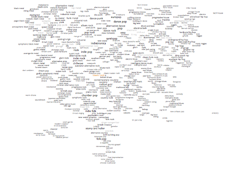
Each genre page in Every Noise at Once now has, down below the big cloud of artists, a little inset map of the set of genres that are either directly related to this one by virtue of overlapping artists, or more tenuously related by virtue of sounding somewhat similar according to the audio analysis we do. The smaller the genre names, the more distant or dubious the relationship.
The data and axes are the same as on the main map, so this allows us to navigate associatively through the second level of the space, and maybe helps us find paths that might not be as evident from afar.
The data and axes are the same as on the main map, so this allows us to navigate associatively through the second level of the space, and maybe helps us find paths that might not be as evident from afar.
¶ Underneath the Noises · 7 June 2013 listen/tech
The Echo Nest company blog has a post from me today explaining a little more about the underpinnings and motivation behind Every Noise at Once.
¶ Noise Adjustments · 31 May 2013 listen/tech
Every Noise at Once began as a byproduct of some data experimentation I was doing at work at the Echo Nest, and although it has taken on something of its own life, as well, the underlying data experimentation continues, and I keep making new maps and plot to help myself think about how we can usefully describe music in numbers.
As I keep emphasizing, the map isn't a data visualization in a strict sense. But it does arise from scatter-plots. In the first versions, the axes went from electric (left) to acoustic (right), and from more sonic density (top) to more sonic spikiness (bottom). After a while I flipped these to be electric (top) to acoustic (bottom), and from more sonic density (left) to more sonic spikiness (right). Both of these worked pretty well, with obvious clusters of things we know are similar in the real world.
Both also had plenty of micro-level oddities. These are just 2 of the 10 dimensions in our actual analyses, and even with 10 dimensions we're not yet always able to distinguish conclusively between things that we as human listeners think of as patently distinct. And the data shifts daily, and the math that bumps things around so we can read them injects its own sort of erosional contours into the process. So things happen, like "intelligent dance music" ending up sandwiched between "southern soul" and "memphis soul". I don't really mind this. At least we got "southern soul" and "memphis soul" close to each other.
But I keep fiddling with the numbers, and with today's map update both axes are now using different calculations to try to get at the same basic ideas more accurately. Or more expressively, maybe.
The acoustic/electric axis (down to up) is now more of an organic/mechanical axis. This doesn't make much difference at the bottom, as the most acoustic forms also tend to be pretty organic. But if anybody comes up with a new genre of robots playing Michael Nyman soundtracks on dulcimers, we now ought to be able to distinguish it from bluegrass. And where the old acoustic/electric scale had both metal and techno forms across the very top, the new organic/mechanical scale recognizes that there's still a lot of organism in highly electrified metal, and reserves the top of the scale for house/techno/synthpop forms that are driven by both synthesized timbres and rhythms. Plus now "futurepop" is top center, and if our dreams of the future don't represent some kind of exaggerated caricature of the present, then what's the point?
The new left-right axis is, similarly, a new attempt to better express the same dense/spiky idea, which I've started describing to myself as "bounciness". At the far left, atmospheric metal and ambient/drone forms are definitively unbouncy, and at the far right, reggae- and hip-hop-derived forms are fine exemplars of what I mean by bouncy or spiky. I didn't know until one of my co-workers added it recently that "bounce" was a genre, and it scores highly on my new bounciness measure, so that's good.
Combine these two axis-changes and the result is that the top left corner of the map kind of rotates, squishily but with a certain arboreal elegance, 45 degrees counter-clockwise:
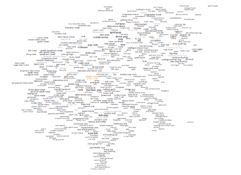
It's hard to imagine that anybody but me really cares about this, in itself. But I think it does a very slightly better overall job of genre-positioning, which is at least partially the point. So now "intelligent dance music" moves up towards chill-out and turntablism, a little farther from old souls. Surf music and experimental rock pull apart (surf up, experimental rock down). The dense and electric, but organic, stoner metal and sludge metal move down, and the similarly dense but more synthetic gothic metal and gothic symphonic metal move up, and the former no longer fall between the latter. Reggaeton moves up closer to moombahton.
Not that there aren't some new curiosities, too. Worship and grunge end up together, but "worship" is a culturally defined genre with a mishmash of musical styles, so it's likely to wander around a bit randomly in any audio-based map (it was next to british pop before). New age ends up between punk blues and garage rock in the new map, which probably is not a juxtraposition with exploratory value, but it was next to video game music before, so whatever. Schlager and breakcore is a similarly hilarious pairing, but in the cluster with german pop, turbo folk and k pop it kind of starts to make sense. Riot grrrl pulls away from the fringes of metal towards lo fi.
So there we are. Minor improvements, maybe. Some days that's what I accomplish. I like to think of it as craftsmanship. Because that definitely sounds better than "fidgeting".
PS: If you don't care about all this, but do care about discovering music, this update also adds the 60s French pop genre ye ye, the Brazilian dance styles pagode and forro, the Scottish traditional form pipe band, and the drum-and-bass variations liquid funk, glitch hop and wonky. And if you care about listening to music, this update also fixes a bug I hadn't noticed that caused only the most prominent bands in each genre to get clickable song-samples, so now all but the really obscure ones ought to have songs again.
As I keep emphasizing, the map isn't a data visualization in a strict sense. But it does arise from scatter-plots. In the first versions, the axes went from electric (left) to acoustic (right), and from more sonic density (top) to more sonic spikiness (bottom). After a while I flipped these to be electric (top) to acoustic (bottom), and from more sonic density (left) to more sonic spikiness (right). Both of these worked pretty well, with obvious clusters of things we know are similar in the real world.
Both also had plenty of micro-level oddities. These are just 2 of the 10 dimensions in our actual analyses, and even with 10 dimensions we're not yet always able to distinguish conclusively between things that we as human listeners think of as patently distinct. And the data shifts daily, and the math that bumps things around so we can read them injects its own sort of erosional contours into the process. So things happen, like "intelligent dance music" ending up sandwiched between "southern soul" and "memphis soul". I don't really mind this. At least we got "southern soul" and "memphis soul" close to each other.
But I keep fiddling with the numbers, and with today's map update both axes are now using different calculations to try to get at the same basic ideas more accurately. Or more expressively, maybe.
The acoustic/electric axis (down to up) is now more of an organic/mechanical axis. This doesn't make much difference at the bottom, as the most acoustic forms also tend to be pretty organic. But if anybody comes up with a new genre of robots playing Michael Nyman soundtracks on dulcimers, we now ought to be able to distinguish it from bluegrass. And where the old acoustic/electric scale had both metal and techno forms across the very top, the new organic/mechanical scale recognizes that there's still a lot of organism in highly electrified metal, and reserves the top of the scale for house/techno/synthpop forms that are driven by both synthesized timbres and rhythms. Plus now "futurepop" is top center, and if our dreams of the future don't represent some kind of exaggerated caricature of the present, then what's the point?
The new left-right axis is, similarly, a new attempt to better express the same dense/spiky idea, which I've started describing to myself as "bounciness". At the far left, atmospheric metal and ambient/drone forms are definitively unbouncy, and at the far right, reggae- and hip-hop-derived forms are fine exemplars of what I mean by bouncy or spiky. I didn't know until one of my co-workers added it recently that "bounce" was a genre, and it scores highly on my new bounciness measure, so that's good.
Combine these two axis-changes and the result is that the top left corner of the map kind of rotates, squishily but with a certain arboreal elegance, 45 degrees counter-clockwise:
It's hard to imagine that anybody but me really cares about this, in itself. But I think it does a very slightly better overall job of genre-positioning, which is at least partially the point. So now "intelligent dance music" moves up towards chill-out and turntablism, a little farther from old souls. Surf music and experimental rock pull apart (surf up, experimental rock down). The dense and electric, but organic, stoner metal and sludge metal move down, and the similarly dense but more synthetic gothic metal and gothic symphonic metal move up, and the former no longer fall between the latter. Reggaeton moves up closer to moombahton.
Not that there aren't some new curiosities, too. Worship and grunge end up together, but "worship" is a culturally defined genre with a mishmash of musical styles, so it's likely to wander around a bit randomly in any audio-based map (it was next to british pop before). New age ends up between punk blues and garage rock in the new map, which probably is not a juxtraposition with exploratory value, but it was next to video game music before, so whatever. Schlager and breakcore is a similarly hilarious pairing, but in the cluster with german pop, turbo folk and k pop it kind of starts to make sense. Riot grrrl pulls away from the fringes of metal towards lo fi.
So there we are. Minor improvements, maybe. Some days that's what I accomplish. I like to think of it as craftsmanship. Because that definitely sounds better than "fidgeting".
PS: If you don't care about all this, but do care about discovering music, this update also adds the 60s French pop genre ye ye, the Brazilian dance styles pagode and forro, the Scottish traditional form pipe band, and the drum-and-bass variations liquid funk, glitch hop and wonky. And if you care about listening to music, this update also fixes a bug I hadn't noticed that caused only the most prominent bands in each genre to get clickable song-samples, so now all but the really obscure ones ought to have songs again.
¶ Chorus of Noises · 27 May 2013 listen/tech
Some notes and discussions in various places about my genre-mapping experiment:
- LIG (Life Is Good Design, Tokyo) blog (via Google Translate)
- Der Kraftfuttermischwerk and followup here and here (all via Google Translate)
- Shades of Graceland (post)
- Bullseye with Jesse Thorn: Mark Frauenfelder's All-Time Favorites: The Hunter by Richard Stark and Every Noise At Once (audio)
- Echo Nest company blog-post about the Bullseye piece above
- MakeUseOf: Discover New Music By Mapping Musical Genres & Artists
- The Story Arcade
- Strangeways: A Map of Musical Genres!
- Sidespin: Put On Your Ear Goggles
- Newsring (France): Mozart, Miles Davis, The Beatles ... The musical geniuses have they been surpassed? (via Google Translate)
- Slate (France): Do You Know All the Musical Genres of the World? (via Google Translate)
- Huffington Post (France): "Every Noise At Once", all genres listed in an interactive infographic (via Google Translate)
- Konbini: Every Noise at Once, an Interactive Music Genres Map
- Freshness: Discovering Music Through Genre Maps
- Sampleface: A Clickable Music Genre Map
- Gizmodo: Possibly the Best Music Discovery System Yet
- Boing Boing: Clickable Musical Genre Map
- The Daily Swarm: This Tool Neatly Explains What All Those Genres Actually Mean
- Turn the Record Over: Listen to Almost Every Music Genre Via This Interactive Map
- The Journal of Music
- Animal: Finally Understand the Difference Between Dance Rock and Synthpop
- Information Is Beautiful Awards
- FastCompany Co.CREATE: Music Map Reveals What "Melodic Death Metal" and Every Other Genre Actually Sound Like
- Metafilter: The map of music
- Quomodocumque (post and discussion)
- I Love Music: Mapping All Music
The last one was instigated by me, and I participated in the Quomodocumque discussion, but I had nothing to do with the others.
Or look for more on Twitter or Google+...
PS: Recent additions include moombahton, c-pop, chinese traditional, chinese indie rock, post-disco, baroque, romantic, classical period, serialism, neue deutsche welle, tekno, gamelan, old-time, tin pan alley and classic garage rock, and improvements to garage rock (which is the modern revival version), death metal and opera.
I also made some tweaks to the artist-mapping code within genres to cut down on spurious outliers a little, and am trying some hopefully-improved logic for picking the example songs for each genre. And I put a "find artist" widget on the front page, which will tell you which genres that artist is in. Keep in mind that I only show a couple hundred representative artists for each genre, so plenty of bands that we would all agree "are" a certain genre won't actually appear in the maps here.
You can also now go from an artist to their Rdio page. The "related artists" on Rdio come from the same Echo Nest data that powers the genre maps, so this lets you keep exploring more or less indefinitely.
And I created a Twitter account for @EveryNoise, which I'll use for minor news and updates, rather than posting every one of them here.
¶ Noisechasing · 26 April 2013 listen/tech
I keep working on the systems from which I derive Every Noise at Once, and update it periodically. It should now be doing a slightly better job than before at picking example songs, like Jimmy Eat World instead of My Chemical Romance for emo, Ornette Coleman instead of Miles Davis for avant-garde jazz, and hopefully etcetera.
We also keep adding genres, the most recent of which are qawwali, steampunk, warm drone, japanese psychedelic, microhouse, bounce, indian pop and electro swing. If you are thinking of inventing a new style of music, please check and see if there are already 241 bands from Slovenia and Malawi fighting over its protocols and implications.
We also keep adding genres, the most recent of which are qawwali, steampunk, warm drone, japanese psychedelic, microhouse, bounce, indian pop and electro swing. If you are thinking of inventing a new style of music, please check and see if there are already 241 bands from Slovenia and Malawi fighting over its protocols and implications.
¶ Scott Miller, 1960-2013 · 18 April 2013
I try to think of words for this inconceivable day, and fail. Better, maybe, to stick with words for more conceivable days, instead.
The roads from "Sleeping Through Heaven" to "720 Times Happier Than the Unjust Man", from "In a Delorean" to "No One's Watching My Limo Ride", from "Too Late for Tears" to "Blackness, Blackness", do not end here. And if it is days before he returns to them, or years, we have this triumphantly hopeless farewell to keep us company. Patience will be painless, and the days of waiting serene.
TWAS 87: All Advice Is Ways of Saying "Let It Go"
TWAS 88: The Excuses, Then the Outcomes, Then the Cause
TWAS 177: Expensive Breathing
TWAS 273: No One Calls But to Weigh In Against Us
And also
Throwing the Election
You had my vote. And not just mine. And whatever else you lived with, I so wish they could have been enough.